STORY BY RENÉE LALONDE
Curious, gutsy, purposeful, inspired, smart and real. There are many terms students used to describe Sheridan, and these are the ones that made their way into Sheridan’s new marketing project. This year Sheridan will be representing its transition into a university with new marketing visuals and, specifically, a new logo.
Sheridan has invested more than $1 million to shift the brand, with the money going toward agency fees, design and production of several items such as the website, brochures and bookstore merchandise. The project will be formally launched in mid-October.
“It’s an investment in the look and feel of Sheridan. A freshening of the brand to go forward, and it aligns nicely with the vision of creating Sheridan University as well. All of those things connect.” said Jeff Zabudsky, president of Sheridan.
The logo and accompanying slogan of “Shine Brighter” has been around since the early 2000s and will be making an exit as it’s gradually replaced by the new visual representation.
“You want to make sure your visual identity matches with where your priorities are, in terms of what the organization’s all about,” said Zabudsky.
Enter the new logo, or wordmark: the font style began as Caslon and underwent some tweaks to better represent Sheridan’s brand. The “S” represents a marriage of practicality and creativity.
“The big ‘S’ is big and bold and brazen and it’s gonna let us do some exciting things with that ‘S’,” said Zabudsky.
Dean Lorenz, the director of marketing and brand strategy described the ‘S’ as a creative trail.
“It’s not strictly about academics and it’s not strictly about this dichotomy that some people think you’re either academic or you’re creative. It’s blending them together.”
In addition to the new wordmark, the slogan underwent a change as well, replacing “shine brighter” with “get creative.”
“It reinforces that innovation, that creative way of thinking that is embodied throughout all the faculties, throughout the programs, the practical teaching, and encouraging students to really challenge the status quo,” Lorenz said.
The visual elements work together collectively with the third element, the signature patterns. Six individual patterns were created to represent the six faculties.
When they’re placed together, a larger overall pattern is created. This is the master pattern that will represent Sheridan.
“It’s really giving (the faculties) a bit of their own identity but they’re still part of the family,” Lorenz said.

The branding project began a year ago when Kaldor, an advertising agency in Vancouver, was hired. A year of research ensued, where 1,000 prospective students were surveyed as well as 800 recent or current Sheridan students to get their opinions and perceptions.
The terms people used to describe their experience at Sheridan provided a direction for the marketing team. Six words, in particular, made their way into the official brand personality: Curious, gutsy, purposeful, inspired, smart and real.

The new logo can already be found on a few items in the bookstore, but more will be available as Sheridan transitions to the new brand.
New recruitment materials will be available from September onward, stationery and business cards will feature the new logo on Oct. 1, and the new website will be up and running by November.
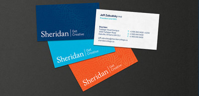
The big message in the visuals is collectiveness, and the idea that creativity can be found in all of Sheridan’s six faculties.
“Sheridan is this boundless source of creativity in everything that we do, not just the arts programs,” said Lorenz.
[box style=”rounded”]More from The Sheridan Sun
[unordered_list style=”arrow”]
- Official launch helps Sheridan celebrate rebranding
- There is something new at Sheridan College …
- Let there be light
- With Sheridan’s new brand comes new art
[/unordered_list]
[/box]
Comments
10 responses to “Sheridan unveils new logo”
Re-read the article and found out the font was Calson and they payed ALOT.
What font was the creator of this logo using when he typed S into his text editor? And we payed him how much?
What font was the creator of this logo using when he typed S into his text editor? And we payed him how much?
Feels like someone went to a Staples and picked from one of their lackluster templates. Not to undervalue Staples that is.
I cannot believe they wasted our tuition on this.
As much as I loved the old logo and design, I love this one! I’m actually standing outside of the Trafalgar campus right now and they put up this giant S and it looks awesome! I’m glad that Sheridan is taking this kind of jump towards being a better institution. Loooove it!
The new “S” looks less like the logo for a multidisciplinary educational institution and more like the letterhead for a series of VERY cheap motels. It says “get creative…. with our complimentary continental breakfast menu”.
What was wrong with the tangram anyway?
2 million on an S. Remember when we had free printing in the learning commons? hahahahaaaaa….
The old logo was much more creative, this looks like it could be from anywhere.
Can we start a petition to keep the old logo?