STORY AND PHOTOS BY MEHREEN SHAHID
For a decade, he has sought solutions to accessibility issues around Sheridan. Finally all his requests and protests are now being heard one-by-one.
Peter Biec started as a student of Journalism–Print, then took some continuing education courses and is now a student of the Advertising, Marketing and Communications program.
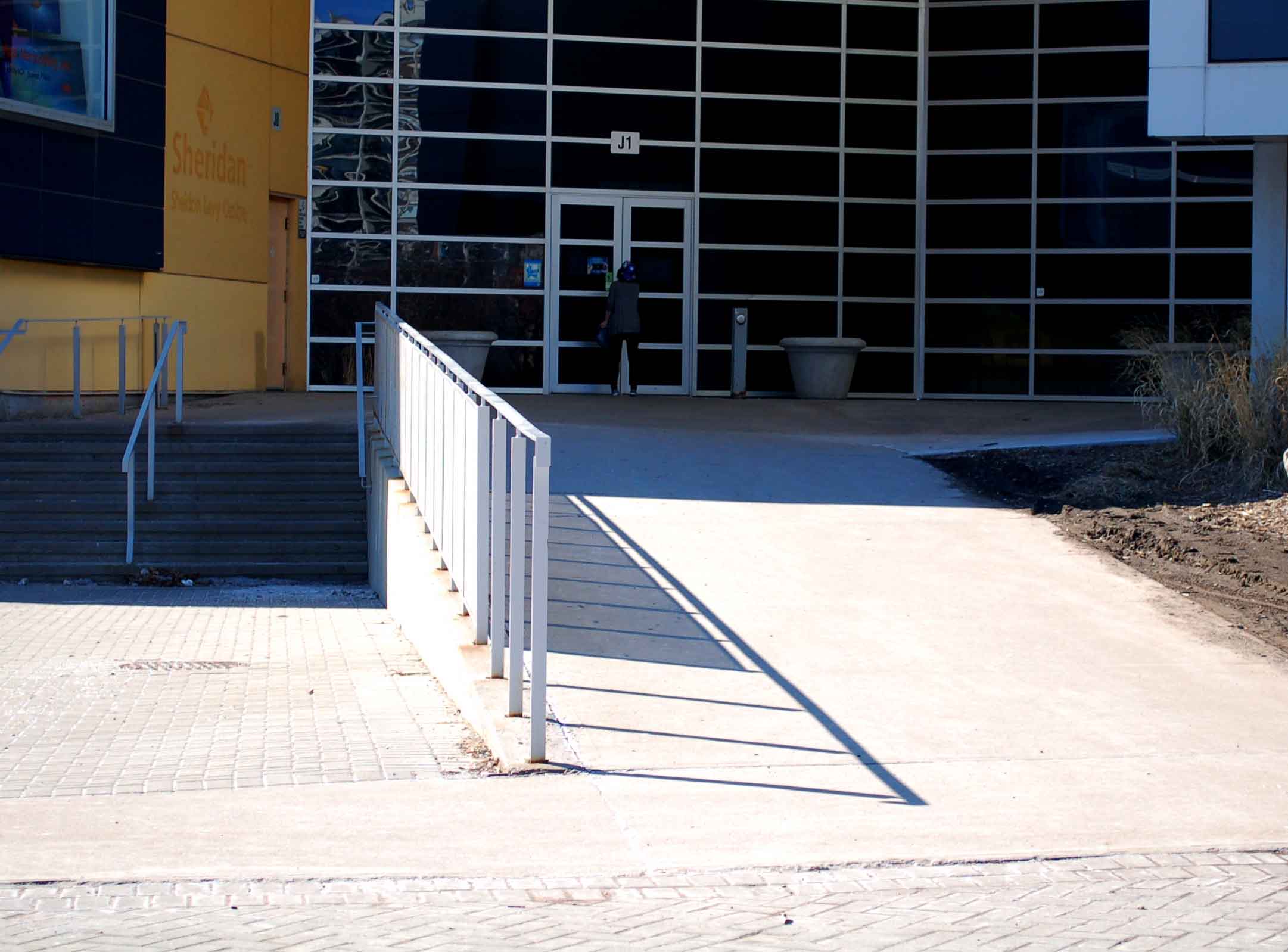
During his 10 years at Sheridan he has raised his voice about various issues including the size of the buttons used to open doors, support handles in the accessible washrooms, improving the ramps used to navigate around college and widening of doorways.
Biec, 28, has cerebral palsy, a condition that forces him to use a wheelchair around campus, coordination problems prevent him from pressing the tiny red buttons for opening doors to classrooms or washrooms. Some of these buttons were replaced with metallic disc-sized ones during the last few years.
Biec says the school has gotten a lot better at listening; administration always made an effort to listen to the students and now the college has an accessibility coordinator, Antonia Hammer, to whom concerns can be voiced.
In an email interview, Hammer said Sheridan has done a lot of work in 2013 to improve accessibility. With the help of Jim Fletcher, director of facilities management, 12 internal doorways have been widened.
Hammer says a lot of structural changes are required and it will take the college a few years to come around to making those changes. Fletcher says clearing maintenance backlog issues depends on the budget available.
Last year, the maintenance budget was $576,000, and it remains unchanged for this year. HMC phase one has better accessibility options, and HMC phase two will be even better, says Fletcher.
Biec praises the administration for having done a good job at the Hazel McCallion Campus. Because HMC is new, it complies better with the Accessibility for Ontarians with Disabilities Act (AODA).
Mary Carroll, a professor in the Interior Design program, teaches human factors, a course that addresses issues related to accessibility in a building and their impact on those using the building. She says Sheridan’s layout does a poor job of meeting AODA requirements.
“The AODA is very rigorous,” says Carroll. “You would have to consider things like if the building is say blue wouldn’t it be sensible to have my building in blue on the map as well? Or some colour remembrance consistent with the colour of the building.”
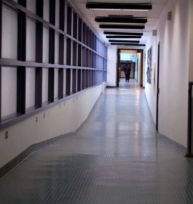
Inconsistent flooring, corridors with sudden changes in direction, lack of signage in general and specific kinds for those with visual impairment are just a handful of the problems she names.
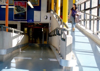
Fellow Sheridan student Mansoor Naderi, a visual artist, shares Biec’s concerns about layout problems. Naderi’s visual impairment requires him to use a cane and he has to manoeuvre his way around campus through what Biec calls “luge hills,” referring to the zigzagging ramps joining the B Wing and C Wing, and dimpled floors that are potential hazards.

Fletcher says the dimpled floors help reduce slips, but both Naderi and Biec face potential physical harm if there is even slight misstep on those ramps. And Naderi’s cane can kick up on the dimpled floor and hit his leg or a passerby.
For Naderi, pillars are a huge problem. He doesn’t understand why the college doesn’t just take down the pillars in the hallway between B Wing and A Wing or paint them in brighter colour. Carroll says the general practice with pillars is to keep them neutral, and that meaning that able-bodied students can see them, but someone with visual impairment might not.
Hammer says the school has tried to minimize hazards for the visually impaired by using colour-contrasted strips on stairs. It helps provide an indication of where steps start and end.
Carroll’s interior design students conducted an experiment on the school’s layout by simulating the experience of people with disabilities.
“I took off my glasses and walked through the space with my eyes closed,” said Tanya Markovic, a first-year student. “There is no sense of changing texture. The floors change, but it’s very slippery.”
Markovic says the study helped students determine the extent to which the campus is suitable for people with accessibility issues. Her friend, Arianne Waligun, shared Markovic’s opinion.
“There is very little consistency throughout the design of the building,” said Waligun. “It was built in different periods and it is very difficult to find your way through it without knowing where you’re going.”

Using the results of their experiment, Waligun and Markovic suggest that the college provide visually impaired students with trackers they could wear on their wrists. Each entrance and doorway in the building would have a sensor above it and every time a person wearing a tracker passes underneath it, the sensor would announce the location and direction the person is headed.
They also recommend using bigger, more colourful signage in a bolder font. Using a colour-coding system, the college could clearly mark the floors of buildings with coloured strips that will follow a legend explaining which strip leads to which building.
The two also suggested that Sheridan could use functional installments like benches and chairs made of colourful and recycled material decorate the college better.
Biec says the main issue the college faces is how to create one solution that works for everyone. To him, it requires some out-of-the-box thinking and some creativity.
“Just because I’m the only person who has asked [for accessible facilities] doesn’t mean I’m the only person who desires to use them,” he says. “My approach to all of this is that I will educate people about accessibility in whatever way I can.”
