STORY AND PHOTOS BY OSCAR IMMEL
The crowd of 250 spectators begins the countdown from 10, and they watch with excitement knowing a new art installation is about to be unveiled.
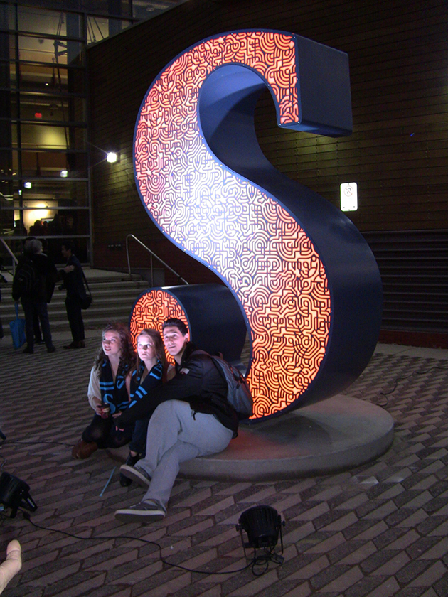
When the crowd reaches “1,” and the sheet is slipped back, a giant ‘S’ that mimics Sheridan’s new logo stands in plain view just outside the main entrance to the SCAET lobby.
Last Friday, between 4:30 to 5:15 p.m., an official launch was held for Sheridan’s new logo and accompanying aesthetic changes.
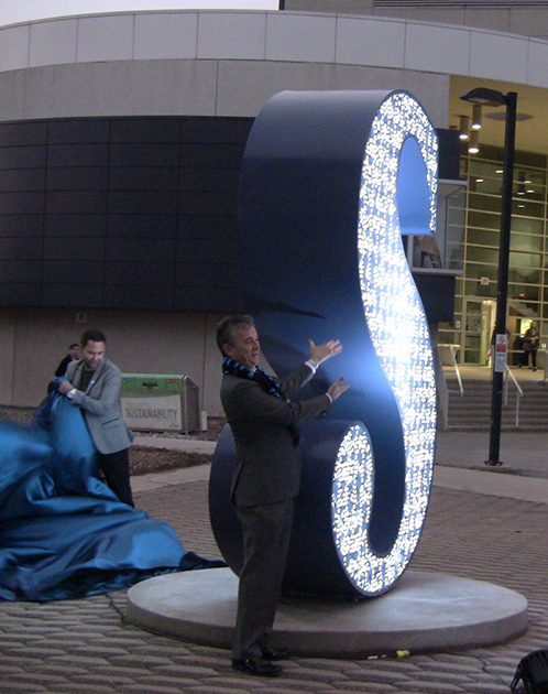
“It is a deep honour to be here today unveiling the school icon,” said Pierre Poussin before the new piece of public art was revealed.
Poussin, who graduated from Sheridan in 2006 for Craft and Design, is the proud creator of the new public art piece that coincides with the rebranding of Sheridan College.
The giant ‘S’ is bold, and its interior LED lights cycle through the different school colours: dark blue, light blue and orange. It also has Sheridan’s master pattern laser-cut into its surface, which is a combination of the six designs that signify each of the college’s different faculties.
One of the main reasons behind the rebranding is to welcome the big changes happening at Sheridan.
“We’re going through a transformation,” said Sheridan College President Jeff Zabudsky. “We’re evolving from a wonderful past as Sheridan College into what is going to be a unique and spectacular Sheridan University.”
The ‘S,’ with its pointed tip trailing into a rounded end, further represents a combination of creativity and hard skills. This is meant to be indicative of the experience a student gains at Sheridan.
“It’s a great logo that’s going to take us into the future,” said Zabudsky.
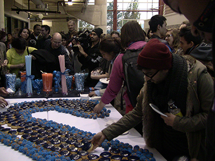
Individuals who attended not only witnessed the reveal of the new installation, but were also treated beforehand to refreshments such as lemonade, various candies and donuts that formed a giant ‘S.’ The food and drinks were appropriately blue.
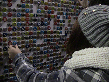
Additionally, there was a wall covered in wearable buttons featuring the new logo.
Reception among the attendees for the official launch of the new logo and the corresponding installation was positive overall.
“I like the design and the texture in it,” said 18-year-old Nawaf Bahadur, Art Fundamentals. “You can see how the ‘S’ isn’t just an ‘S’ anymore. I think having the coloured ‘S’ with the texture is better than the old logo with the yellow diamond.”
Others agreed it was a nice move forward for Sheridan.
“I was just interested to see the launch and the culmination of the work,” said Carolina Salcedo, project coordinator in Sheridan’s office of undergraduate research. “I like it a lot. I think it’s different, but it retains the Sheridan spirit. I think it’s a really nice move forward for our institution as we move closer to becoming a university. And I love the sculpture. I think it looks beautiful.”
To date, Sheridan has invested more than $1 million into the rebranding project, which extends to design costs, website changes and the production of brochures and bookstore merchandise.
The new website was launched the same day as the unveiling of the public art piece, and can be visited at www.sheridancollege.ca.
A detailed look at the new Sheridan logo and its accompanying aesthetics here.
[box style=”rounded”]More from The Sheridan Sun
[unordered_list style=”arrow”]
- There is something new at Sheridan College …
- Let there be light
- With Sheridan’s new brand comes new art
- Sheridan unveils new logo
[/unordered_list]
[/box]